
It’s no secret that communicating results to your team is a big part of the data science craft. This is where we drive home the value of our work, allowing our stakeholders to understand, monitor, and ultimately make decisions informed by data. One tool we frequently use at Shopify to help us is the data dashboard. This post is a step-by-step guide to how you can create dashboards that are user-centred and impact-driven.
People use the word “dashboard” to mean one of several different things. In this post I narrow my definition to mean an automatically updated collection of data visualisations or metrics giving insight into a set of business questions. Popular dashboard-building tools for product analytics include Tableau, Shiny, or Mode.
Unfortunately, unless you’re intentional about your process, it can be easy to put a lot of work into building a dashboard that has no real value. A dashboard that no one ever looks at is about as useful as a chocolate teapot. So, how can you make sure your dashboards meet your users’ needs every time?
The key is taking a product thinking approach. Product thinking is an integral part of data science at Shopify. Similar to the way we always build products with our merchants in mind, data scientists build dashboards that are impact-focused, and give a great user experience for their audience.
When to Use a Dashboard
Before we dive into how to build a dashboard, the first thing you should ask yourself is whether this is the right tool for your situation. There are many ways to communicate data, including longform documents, presentations, and slidedocs. Dashboards can be time consuming to create and maintain, so we don’t want to put in the effort unnecessarily.
Some questions to ask when deciding whether to build a dashboard are
- Will the data be dynamically updated?
- Do you want the exploration to be interactive?
- Is the goal to monitor something or answer data-related questions?
- Do users need to continuously refer back to this data as it changes over time?
If most or all of the answers are “Yes”, then a dashboard is a good choice.
If your goal is to persuade your audience to take a specific action, then a dashboard isn’t the best solution. Dashboards are convenient because they automatically serve updated metrics and visualisations in response to changing data. However, this convenience requires handing off some amount of interpretation to your users. If you want to tell a curated story to influence the audience, you’re better off working with historic, static data in a data report or presentation.
1. Understand the Problem and Your Audience
Once you have decided to build a dashboard, it’s imperative to start with a clear goal and audience in mind—that way you know from the get-go that you’re creating something of value. For example, at Shopify these might be
|
Audience |
Goal |
|
Your data team |
Decide whether to ship an experimental feature to all our merchants. |
|
Senior leadership |
Monitor the effect of COVID-19 on merchants with retail stores to help inform our response. |
|
Your interdisciplinary product team |
Detect changes in user behaviour caused by shipping a new feature. |
If you find that you have more than one stated goal (for example, both monitoring for anomalies and tracking performance), this is a flag that you need more than one dashboard.
Having clearly identified your audience and the reason for your dashboard, you’ll need to figure out what metrics to include that best serve their needs. A lot of the time this isn’t obvious and can turn into a lengthy back and forth with your users, which is ok! Time spent upfront will pay dividends later on.
Good metrics to include are ones carefully chosen to reflect your stated goals. If your goal is to monitor for anomalies, you need to include a broad range of metrics with tripwire thresholds. If you want a dashboard to tell how successful your product is, you need to think deeply about a small number of KPIs and north stars that are proxies for real value created.
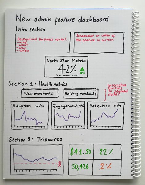
Once you’ve decided on your metrics and data visualisations, make a rough plan of how they are presented; this could be a spreadsheet, something more visual like a whiteboard sketch, or even post-it notes. Present this to your stakeholders before you write any code: you’ll refine it as you go, but the important thing is to make sure what you’re proposing will help to solve their problem.
Now that you have a plan, you’re ready to start building.
2. Build a Dashboard with Your Users In Mind
The tricky thing about creating a dashboard is that the data presented must be accurate and easy to understand for your audience. So, how do you ensure both of these attributes while you’re building?
When it comes to accuracy and efficiency, depending on what dashboard software you’re using, you’ll probably have to write some code or queries to create the metrics or visualisations from your data. Like any code we write at Shopify, we follow software best practices.
- Use clean code conventions such as Common Table Expressions to make queries more readable
- Use query optimisations to make them as run as efficiently as possible
- Use version control to keep track of code changes during the development process
- Get the dashboard peer reviewed for quality assurance and to share context
The way that you present your data will have a huge impact on how easily your users understand and use it. This involves thinking about the layout, the content included or excluded, and the context given.
Use Your Layout to Focus Your Users’ Attention
Like the front page of a newspaper, your users need to know the most important information in the first few seconds.
One way you can do this is to structure your dashboard like an inverted pyramid, with the juicy headlines (key metrics) at the top, important details (analysis and visualisations) in the middle, and more general background info (interesting but less vital analyses) at the bottom.

Remember to use the original goals decided on in step one to inform the hierarchy.
Keep the layout logical and simple. Guide the eye of your reader over the page by using a consistent visual hierarchy of headings and sections where related metrics are grouped together to make them easy to find.

Similarly, don’t be afraid to add whitespace, it gives your users a breather, and when used properly it increases comprehension of information.
Keep Your Content Sparing But Targeted
The visualizations you choose to display your data can make or break the dashboard. There’s a myriad of resources on this so I won’t go in-depth, but it’s worth becoming familiar with the theory and experimenting with what works best for your situation.
Be brave and remove any visualisations or metrics that aren’t directly relevant to stated goals. Unnecessary details bury the important facts under clutter. If you need to include them, consider creating a separate dashboard for secondary analyses.
Ensure Your Dashboard Includes Business and Data Context
Provide enough business context so that someone discovering your dashboard from another team can understand it at a high level, such as:
- Why this dashboard exists
- Who it’s for
- When it was built, and if and when it’s set to expire
- What features it’s tracking via links to team repositories, project briefs, screenshots, or video walkthroughs
Data context is also important for the metrics on your dashboard as it allows the user to anchor what they are seeing to a baseline. For example, instead of just showing the value for new users this week, add an arrow showing the direction and percentage change since the same time last week.

You also can provide data context by segmenting or filtering your data. Different segmentations of data can give results with completely opposite interpretations. Leveraging domain-specific knowledge is the key to choosing appropriate segments that are likely to represent the truth.
Before You Ship, Consider Data Freshness
Your dashboard is only as fresh as the last time it was run, so think about how frequently the data is refreshed. This might be a compromise between how often your users want to look at the dashboard, and how resource-intensive it is to run the queries.
Finally, it’s best practice to get at least two technical reviews before you ship. It’s also worth getting sign-off from your intended users. After all, if they don’t understand or see value in it, they won’t use it.
3. Follow Up and Iterate
You’ve put in a lot of work to understand the problem and audience, and you’ve built a killer dashboard. However, it’s important to remember the dashboard is a tool. The ultimate goal is to make sure it gets used and delivers value. For that you’ll need to do some follow-up.
Market It
It’s up to you to spread awareness and make sure the dashboard gets into the right hands. The way you choose to ‘market’ your dashboard depends on the audience and team culture, but in general, it’s a good idea to think about both how to launch it, and how to make it discoverable longer-term.
For the launch, think about how you can present what you’ve made in a way that will maximise uptake and understandability. You might only get one chance to do this, so it’s worth being intentional. For example, you might choose to make a well-crafted announcement via a team email and provide an accompanying guide for how to use the dashboard, such as a short walk-through video.
In the long-term make sure that after launching your dashboard that it's easily discoverable by whoever might need it. This might mean making it available through an internal data portal and using a title and tags tailored to common search terms. You might think about ways to re-market the dashboard once time has passed. Don’t be afraid to resurface or make noise about the dashboard when you find organic moments to do so.
Use It and Improve It
Return to the goals identified in step one and think about how to make sure these are reached.
For example, if the dashboard was created to help decide whether to ship a specific feature, set a date for when this should happen and be prepared to give your opinion to the team based on the data at this point.
Monitor usage of the dashboard to find out how often it’s being used, shared, or quoted. It gives insight into how much impact you’ve had with it.
If the dashboard didn’t have the intended outcome, figure out why not. Is there something you could change to make it more useful or would do differently next time? Use this research to help improve the next dashboard.
Maintain It
Finally, as with any data product, without proper maintenance a dashboard will fall into disrepair. Assign a data scientist or team to answer questions or fix any issues that arise.
Key Takeaways
I’ve shown you how to break down the process of building a dashboard using product thinking. A product-thinking approach is the key to maximising the business impact created proportional to the time and effort put in.
You can take a product-thinking approach to building a impact-driving dashboard by following these steps:
- Understand your problem and your audience; design a dashboard that does one thing really well, for a clear set of users
- Build the dashboard with your users in mind, ensuring it is accurate and easy to understand
- Follow up and iterate on your work by marketing, improving and maintaining it into the future.
By following these three steps, you will create dashboards that put your users front and centre.
Lin has been a Data Scientist at Shopify for 2 years and is currently working on Merchandising, a team dedicated to helping our merchants be as successful as possible at branding and selling their products. She has a PhD in Molecular Genetics and used to wear a lab coat to work.
If you’re interested in using data to drive impact, we’re looking for talented data scientists to join our team.