


Updated for compatibility with Hydrogen 0.26.0
Last year we released Hydrogen, our React-based framework for building custom storefronts. Hydrogen allows developers to build fast, dynamic commerce experiences by leveraging streaming server-side rendering, React Server Components, and caching APIs. Hydrogen is currently in developer preview and I'm excited to show you how you can rapidly build out a simple product page by leaning on Hydrogen's components.

Previously, constructing a custom storefront required developers to manually manipulate data and create custom components for each page. Hydrogen accelerates this process by offering Shopify-specific commerce components, hooks, and utilities that allows developers to focus on the fun stuff - building unique storefront experiences.
Getting Started
To get started, generate a new Hydrogen app with the ‘Hello World’ template over on StackBlitz.
Most of the files you’ll work with are located in the /src directory. This directory will contain routes, components and the main app component (App.server.jsx). For an in-depth overview, see the getting started guide.
Add a styling library
We’ll be using the Tailwind CSS framework to style the product page today. You can learn more about Tailwind on Hydrogen here.
- Stop the StackBlitz development server (CTRL + C)
- Install tailwindcss and its peer dependencies, and generate the tailwind.config.js and postcss.config.js files:
$ npm install -D tailwindcss @tailwindcss/typography postcss autoprefixer$ npx tailwindcss init -p - Add the paths to the template files in your tailwind.config.js file:
- Add Tailwind directives to /src/index.css:
- Start the development server again.
$ vite
You now have access to Tailwind classes, make a change to the Index route and watch the styling kick in:

Creating a Product route
Hydrogen uses file-based routing. To register a /products/snowboard route, we can create a /src/products/snowboard.server.jsx component.
Given product handles are dynamic, we want to catch all /products/:handle requests. We can do this by using square brackets to define a parameter.
Create a new file /src/routes/products/[handle].server.jsx and export a Product component. We can lean on the useRouterParam hook to retrieve the handle parameter:
Pointing your browser to /products/the-full-stack renders a simple header and the the-full-stack handle on screen:

Fetching data
Hydrogen communicates with Shopify via the Storefront API which makes it possible for customers to view products and collections, add products to a cart, and check out. Hydrogen conveniently exposes a useShopQuery hook to query the Storefront API, with an access token already configured (the details can be found in /shopify.config.js).
Out of the box, the Demo Store and Hello World templates are connected to a Hydrogen Preview store, which has a number of snowboard collections, products, variants and media - ideal for testing.
Import the useShopQuery hook and use the dynamic product handle to fetch a product’s title and description:
By providing a prose class to the description, Tailwind CSS Typography plugin adds typographic defaults to the vanilla HTML pulled from the Shopify Admin.

Using state
Hydrogen implements React Server Components which allows the server and the client (the browser) to collaborate in rendering the React application (learn more). By default, all routes are server components.
We'll be using a ProductOptionsProvider component to set up a context with state that tracks the selected variant and options. To use state, create a client component (/src/components/ProductDetails.client.jsx) and import it into your server component (/src/routes/products/[handle].server.jsx).
Update the product query to fetch product media, variants and options, and then wrap the product details in a ProductOptionsProvider component.
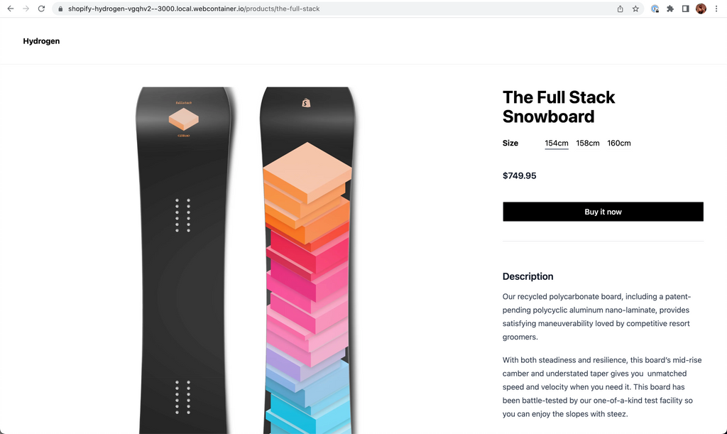
With the context in place, it's a breeze to build out the interactive parts of the product page, like the variant selector. By leaning on the ProductOptions hook we can get a list of options and manage selected option state. Passing the selected variant ID to ProductPrice dynamically updates the selected variant’s price.

Adding a buy button
Hydrogen exports a BuyNowButton component which sends customers to checkout. Get the selected variant ID, and pass it to a BuyNowButton. If the selected variant is out of stock, display a message:
Media gallery & finishing touches
With a functioning product page in place, create a media gallery (you guessed it, there's a component for that too) and add add some additional styling:
The final code is found on StackBlitz.
Hydrogen Enables Rapid Development
Taking advantage of these components, hooks and utilities allows you to skip many of the repetitive parts of building a custom storefront, speeding up the development process.
I hope Hydrogen has piqued your interest. Explore the docs or build a complete storefront by following the new tutorial and take Hydrogen for a spin on your next project!
Scott’s a Developer Advocate at Shopify, located on the east coast of Australia and formerly a Shopify app developer and developer bootcamp coach. When he's not tinkering with code, you'll find him checking the surf or hanging out with his family.
Wherever you are, your next journey starts here! If building systems from the ground up to solve real-world problems interests you, our Engineering blog has stories about other challenges we have encountered. Intrigued? Visit our Engineering career page to find out about our open positions and learn about Digital by Default.